Branding elements
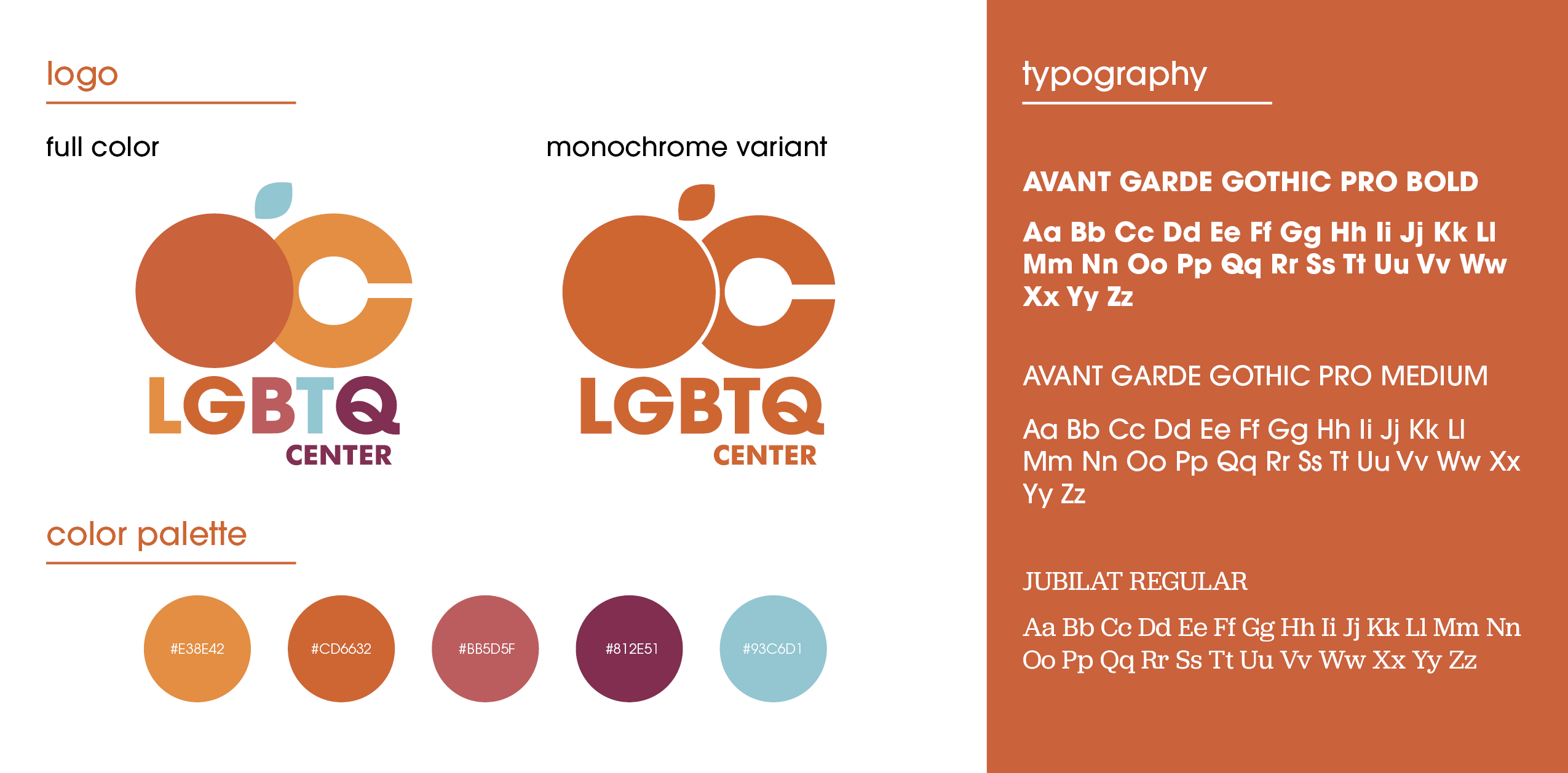
Established in 1971, the LGBTQ Center OC is one of the oldest LGBT centers in the United States. For almost 50 years they have served as a network for the LGBT community and their allies in Orange County, working towards community empowerment, support, and unity. Our goal was to establish a new identity for LGBTQ Center OC in an effort to stand out from the other noteworthy centers in the area. We wanted to recognize the seriousness of what they do while also being engaging, fun and bold. Honoring the history of the organization, we used elements evocative of the 1970s to create a warm and welcoming visual brand identity.
poster series
T-Shirts
Buttons
Event design: “Queer and Now”
LGBTQ Center OC already has an exhibition space and regularly partners with a local gallery to showcase LGBT artists. To increase visibility, we designed a modular pop-up exhibit that can be set up in public places where one wouldn’t usually encounter art – parks, shopping centers, etc. This would help introduce members of the public to LGBTQ art they might not have sought out on their own, as well as raise general awareness for the Center in a celebratory, vibrant way.
To provide signage, display information, and delineate space, we designed a set of printed panels to place around the exhibit. Each divider is comprised of four 3ft by 8ft panels, for a total dimension of 12ft by 8ft.
To display the art, I designed a system to use with “Playwood” connector clamps and medium density fiberboard. These modular structures can be relatively quickly be set up and taken apart. Artwork hangs from these pillars using a hook and cable attached to the top of the panel, and text is applied with clear decals. This way, artwork can be switched out for future exhibits without having to replace the panels. Each panel of the display column is 4ft square, to create a pillar 8ft tall and 4ft wide.
The counter for Center information and merchandise would be 4ft wide, 2ft deep, and 3ft tall. To tie in the exhibit with LGBTQ Center OC branding, boards are painted brand colors, and the front of the counter is printed with the LGBTQ OC pattern and logo.

The advantage of using modular elements is that the exhibit can be rearranged to fit different spaces — there are a number of ways to set up the exhibit. This is an example of how the event could be configured.

Event mock-up renders
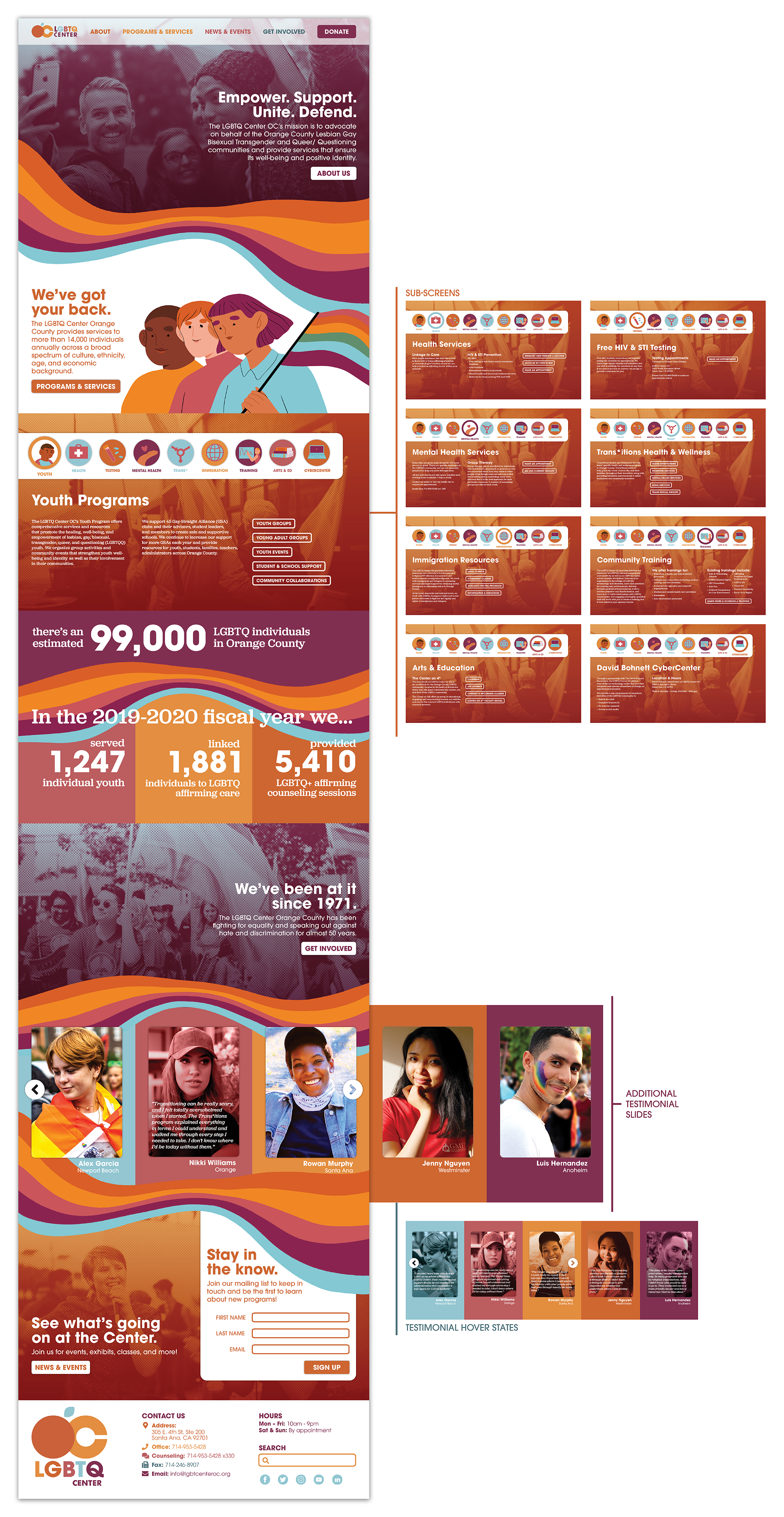
Website design
Home page - desktop
Home page - mobile
Donation page - desktop & mobile

For our Advanced Design Practice course, illustrator and designer Maureen Keeney and I teamed up to thoroughly rebrand the LGBTQ Center of Orange County.
Maureen and I worked closely together on this project, but we each took charge of different elements. I ended up primarily working on the website design, posters, merchandise, and event design. Maureen primarily worked on social media assets, stationary and print publications, brand illustrations, and visual identity elements for the planned event. I created the color scheme, photo choices, image treatments, and alternate logo used on some merchandise, while Maureen created the main logo, rainbow pattern and all of the illustrations.

